
![]()
Concept:
A client working as an independent drummer requested a logo design for a business card. They were looking for something modern with a vintage twist.
Process:
First step was to think about the different elements that the design would need. What would a person look at and understand that it was related to drumming? The first immediate pieces that come to mind our drum sticks, and a drum itself. Alternatively, those elements are very popular and are frequently used, thus proving a challenge in making them seem natural and not cliché.
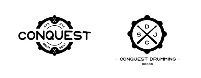
After combining the elements, and including a vintage theme two potential designs emerged. Both attempting to use the drum sticks and drum silhouette to create transparency in the company behind the logo. The one to the right, although simple and vintage, gives off a generic tone. It is missing a unique element that the one to the left provides.
Final Product:
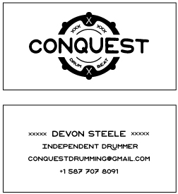
The final product of the business card was constructed as shown below. The same font from the logo design is tied into the back portion of the card to create consistency.
Feedback:
- Some subtle elements of color or shading could have brought the logo to a slightly more modern level.
- The drumsticks are slightly hard to distinguish within the logo and could have been altered to be somewhat thicker or more bold.
