Concept:
A client was interested in a logo design that incorporated a QR code and elements of three dimensional design.
Process:
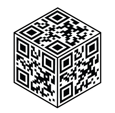
To combine both a simple 3D design into a 2D logo, and the requested QR code, the first shape that made sense was a cube. The QR code itself is in a square shape, and the logo design needed to be built around that specification.
At first, a more asymmetrical design was conceptualised and presented to the client. Two versions were created, one shaded for a more 3D effect and the other minimal with a simple black and white color scheme.

The simple black and white theme was preferred and brought into the final design.
In order to create a more symmetrical and visually appealing image, I shifted the angle of the cube to face equally on all sides. This displayed the QR code equally as well, contributing to the original concept.
Final Product:
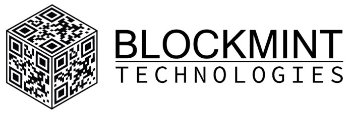
The finished cube was created, and following approval from the client the companies name was added to the side of the logo.
Feedback:
- A stronger typeface could have been used to mirror the solid feel of the logo itself.
