Client was interested in a logo for their online cooking show, GalleyMan, shot from his boats kitchen.
Concept:
The first thought process I delved into was in what ways I could combine both nautical and culinary elements together into a simple design. Preliminary notes and sketches narrowed down both categories into only a handful of items to represent each list. Through process of elimination two prospective designs emerged.

Challenges:
Most nautical designs incorporate the use of a handful of very recognizable symbols. In order for this logo to stand out the design needed a unique element to it that broke away from the norm.
First I tried to physically meld both elements together into one conglomerate shape, but quickly found it too hard to recognize and distinguish.
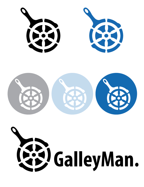
Next I attempted the opposite, cutting the culinary object out of the logo to define it through negative space. This left the logo with a more modern twist, and made it so both elements could be seen independently from one another.
Final Product:
Through this work flow I completed two potential logo’s to present to the client. A respective cool toned color scheme is shown with the logo in white to represent it’s contrast against different backgrounds.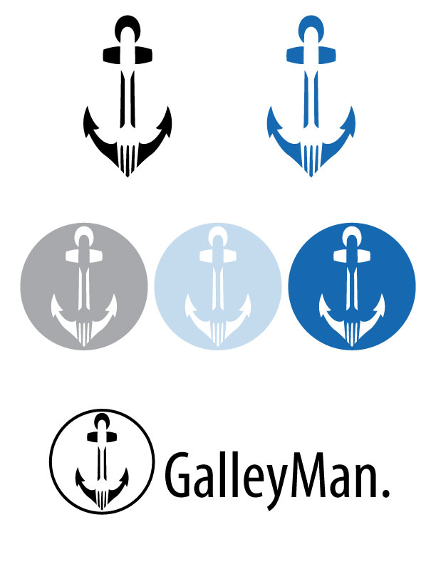
Feedback:
- A consistent font and stroke should have been used between both logo versions.
